Tuesday, 28 November 2017

14. Anna Atkins Cyanotypes


Anna Atkins was an artist of the 19th century. She was a botanist and a photographer,
Some sources claim that she was the first woman to create a photograph, whereas others claim that she was the first to publish a book illustrated with photographs.

Her practice revolved around cyanotypes and nature.
Her botanical photographs are known as some of the first of their kind.

Anna Atkins was fortunate to be a friend of the man who created the cyanotype photographic process in 1842. (John Herschel)

Within a year, Anna Atkins placed her creativity into the cyanotype process. Cyanotyping relies on UV light and oxygen to develop. AKA sunlight and air, all natural substances. She began to use organic substances such as plant stems and leaves to work as a stencil, allowing the cyanotype ink to develop everywhere apart from beneath the "stencil", which created exact prints of the materials she used. Below are some examples of her work.


The sunlight is blocked by the features of the feather, but you can see where some sunlight began to seep through the thinnest parts of the feather.

The flower petals are thin enough to let the sunlight through in this image, leaving ghostly silhouettes of each individual petal. I wonder how cyanotype paper would react to crystals, and the way that they can refract light.


These leaves are almost entirely translucent, leaving only the skeletons and veins of the leaves in pure white.


I am in love with the idea of cyanotyping due to the fact that it requires only strictly natural elements to develop art. Oxygen, sunlight and in some cases, water. I am specifically in love with Anna Atkins' work because of her strict use of natural found materials, such as British flowers, leaves and feathers. 

Many of Atkins' prints are solid and highly contrasting, such as the one below.

This plant is completely opaque, which led to a print with solid juxtaposition between blue and white. I love this effect, although I find that the prints with more depth and personality are those with translucent features, such as the one below.
In this print, we can see not only the shape of the plant, but the veins of each individual leaf, which I think is beautiful.


I will set out to experiment with my own cyanotype prints, but meanwhile, I intend to experiment with turning my own photographs into cyanotype prints by using Paint Tool SAI.

PHOTOMANIPULATING IMAGES TO LOOK LIKE CYANOTYPES:


This final result is much more pleasing to me personally. I will use this same method on some other images in an attempt to create some interesting faux cyanotypes.


EVALUATION:

What did I do?
I created some false cyanotypes by using Paint Tool SAI to create photomanipulations of my own images, to create digital pieces with a similar affect to an organic cyanotype.

Why did I do it?
I do not have the immediate access to a cyanotyping facility.

How did it go?
I feel that these digital cyanotypes are intriguing to look at, and although they are not as completely organic as Anna Atkins' original cyanotypes, they hold their own charm and unique quality.
I feel that the roughing of the edges, as well as the aged paper texture overlay consecutively brought the digital pieces to life.
If nobody knew better, I feel that perhaps they could pass for scans of genuine cyanotypes.

What sources of information did I use?
I studied Anna Atkins' cyanotypes visually, and used my own knowledge of digital medium to apply the photomanipulation. I learnt how to use Paint Tool SAI over years of experimentation.

Evaluating my own VS Anna Atkins' originals?:

My pieces are clearly not genuine cyanotypes, told by the way that the silhouettes of solid objects are not solid white.
There is some false translucency connoted by the patches of blue on items such as the scorpion.
On a genuine cyanotype, the silhouette of the scorpion would be entirely white as it would have entirely blocked the sunlight.

ALTHOUGH, I do find my own images to be more interesting in terms of subject, whether they are false or not.
I enjoy the contrast between Atkins' subjects and my own. Atkins uses delicate natural forms such as flimsy leaves, flowers and feathers. They are desirable, stereotypically beautiful pieces of nature. Whereas on the other hand, I have used items that were once ALIVE animals, including a scorpion that has connotations of being dangerous, foreign and disgusting.

I think that the contrast is interesting and slightly shocking, as cyanotyping is a very delicate, natural, calming process, and a scorpion is none of those things. I enjoy the juxtaposition between 'naughty and nice.'


Experimenting with pre-bought pre-prepared "DIY cyanotype" papers.

I purchased a pack of "DIY cyanotype" papers. They were marketed towards children and parents to be used as a "fun and easy" experiment. I was sceptical as to whether they would work or not.


LONG STORY SHORT: They didn't work very well.

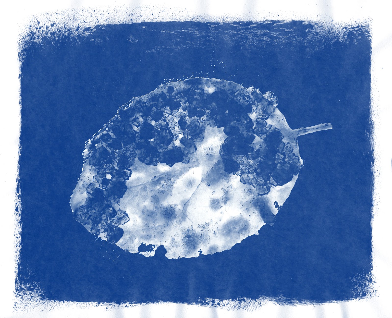
I experimented by using several differently shaped/sized/textured items. I thought that using semi-transparent crystals would give interesting effects, as the light would penetrate slightly and the paper would react accordingly.

I allowed the papers to sit for 3 or 4 days. To "activate" the cyanotype, they needed to be submerged in water.

The instructions insisted that they needed to become wet to activate the cyanotype effect, but all it did to my pieces of paper was weaken them so that they disintegrated in my hands.


Thursday, 23 November 2017

13. Response to Hirst / LeKay / Anselm


I took inspiration from Damien Hirst, John LeKay and Vladimir Anselm to create my own rendition of a crystal skull.

Problem Solving:

Problem 1: Materials: I would like to achieve a clear, crystalline effect. But, I have no access to diamonds, and paradichlorobenzene is a dangerous substance to work with.
Solved: Stick to borax or alum. I will experiment with borax first because it acts more quickly.

Problem 2: I have no access to a human skull.
Solved: Source a fake one.
I chose paper, because the crystals I plan to use will adhere better to paper than plastic.


About the size of a mug.


Process:


1. I suspended the paper skull in a richly saturated borax solution.
I sprinkled some extra borax over and on top of the solution afterwards, so that it would land on the skull and provoke the crystals to grow in the right place.

The paper skull was buoyant and refused to stay underwater, so I placed 3 or 4 2p coins inside to weigh it down.

5 or 6 hours later, I could see the crystals beginning to form.

In the morning the crystals had completely overtaken the jar.

This is the crystal skull immediately after being removed from the jar.
It was delicate, wet and shiny. I took some photos whilst it was still wet, because I loved how the crystals appeared transparent.


I took some inspiration from Tyler Thrasher for the presentation of this piece. I tried to use real mineral points to frame the skull.
They are quartz points, and quartz is usually clear or white like borax crystals.


Below I tried to incorporate the genuine crystals into my artificial crystals. I think that it works well, and I feel that the photograph is very successful.


I used photoshop to alter the colouring of the image below, to make it look like the crystals are natural amethyst.


I experimented wildly with the colours of another photograph. It looks psychedelic and bright. It looks beautiful, but it is not the effect I am going for. I want an ethereal, delicate look.


I think that this level of colour is acceptable, but still removes from the natural beauty of the photograph.

I experimented with removing colour from the photographs altogether, in order to allow the viewer to focus on the form of the piece rather than the colours.

Also, monochrome matches the pieces of the artists I am taking inspiration from. Hirst, LeKay and Anselm all made skulls purely in black and white.


I already think that the images look much better in strongly contrasting black and white. The lack of colour draws interest to the formations of the crystals, and how they reflect the light.


I experimented with placing certain images on black backgrounds using photoshop, taking inspiration from the display of "For The Love Of God".

I think that these images are very powerful and successful, as they force you to pay attention to the main subject and attempt to decipher what it is.

I openly accept that it does not much like a skull from some angles -
BUT, I also think that adds to the effect, as both LeKay and Anselm's skull pieces are deformed and irregular in shape..


After the skull had dried, it lost a great deal of its transclucent qualities. The crystals clouded and became almost completely white. I still think that it looks beautiful. Here it is pictured with some genuine minerals from my collection.


I may take some higher standard photographs of the clouded skull at some point, but I fear they will not have the same impact as the original translucent crystals.

The above was mostly a response to Hirst and LeKay. I decided to take it one step further by editing my photographs in order to match Anselm's signature dark style.


I used an online tool to invert the colours of the black and white images I had taken before. This turned black to white and white to black, making the white crystals appear sunken and dark, LIKE COAL, whilst making the background white.

It is not quite as effective as using coal.
But it does carry that slightly otherworldly, intimidating aura that Anselm's pieces carry.
Inverted images generally look wrong because everything that we would assume to be light is dark.
It is like an optical illusion or trick of the light.
They appear eerie and almost suitable for a horror genre poster, in my opinion.


The above image specifically reminds me of a black and white print, maybe using ink or cyanotype.

I used Paint Tool SAI to add colour to this image using a layer effect.


I am interested in prints - especially cyanotypes. I will explore the artist Anna Atkins, who created cyanotypes of natural forms such as leaves, feathers and plants in the 1800s.

See a separate post for a further development of this idea.


REVIEW:

What did I do?:

I crystallised a paper skull using a saturated borax solution, and experimented with photography and photomanipulation.

Why did I do it?

I wanted to create a response to Damien Hirst, John LeKay and Vladimir Anselm's crystal skulls.
I used the materials that I did to conform to health and safety rules, ethical rules and budget rules.

How did it go?

I did not achieve the effect that I wanted to entirely. I would have originally liked the skull to be COMPLETELY engulfed in crystal so that the paper beneath was no longer visible. However, the top of the skull is very sparsely decorated. I thought that this would be a problem, but in reality, I find that it is more effective. It makes the viewer question what is real and what is not.

Did I achieve the effect that I wanted to?

No, (because of the above) but I achieved an even greater feat. I thought that it would be very obvious that it was a paper skull, but a passer by seemed very concerned and genuinely asked whether it was some kind of monkey skull. I like this idea of disillusion of what is real and what is not.

What meaning does it carry?

Once again I am carrying themes of life, death and immortality. Crystals, although delicate, are immortal. Thus, meaning anything that I grow crystals onto will be immortal with them.
The idea that a SKULL is immortal is very ironic and intriguing. Not to mention that skulls are supposed to carry connotations of death, fear, discomfort and darkness, whereas crystals are the complete opposite. Crystals are precious, loved, respected and desireable.
They glimmer in the light like diamonds which could also connote wealth.
Finally, a theme that I have carried throughout my project is the juxtaposition between organic and geometric shapes. The skull is round with no harsh edges, whereas the crystals are sharp and blocky. This contrast in aesthetics is interesting to me, and I feel that it brings our attention to the many shapes that naturally occur in nature.

What would I do differently next time?

I may use a skull that looked more realistic, and I may swap the borax crystals for alum. Alum crystals can grow much larger than borax crystals depending on how long they are allowed to sit. E.G if I left my skull to bathe in borax for a week, the crystals would remain the same. But alum crystals would slowly grow day by day until the crystals were the size of coins or larger. I wonder how this would affect the impact of the piece, as the shape of the skull would be inevitably deformed by the large crystals.