Anna Atkins was an artist of the 19th century. She was a botanist and a photographer,
Some sources claim that she was the first woman to create a photograph, whereas others claim that she was the first to publish a book illustrated with photographs.
Her practice revolved around cyanotypes and nature.
Her botanical photographs are known as some of the first of their kind.
Anna Atkins was fortunate to be a friend of the man who created the cyanotype photographic process in 1842. (John Herschel)
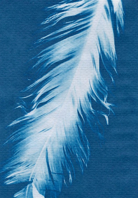
Within a year, Anna Atkins placed her creativity into the cyanotype process. Cyanotyping relies on UV light and oxygen to develop. AKA sunlight and air, all natural substances. She began to use organic substances such as plant stems and leaves to work as a stencil, allowing the cyanotype ink to develop everywhere apart from beneath the "stencil", which created exact prints of the materials she used. Below are some examples of her work.
 |
| The sunlight is blocked by the features of the feather, but you can see where some sunlight began to seep through the thinnest parts of the feather. |
The flower petals are thin enough to let the sunlight through in this image, leaving ghostly silhouettes of each individual petal. I wonder how cyanotype paper would react to crystals, and the way that they can refract light.
These leaves are almost entirely translucent, leaving only the skeletons and veins of the leaves in pure white.
I am in love with the idea of cyanotyping due to the fact that it requires only strictly natural elements to develop art. Oxygen, sunlight and in some cases, water. I am specifically in love with Anna Atkins' work because of her strict use of natural found materials, such as British flowers, leaves and feathers.
Many of Atkins' prints are solid and highly contrasting, such as the one below.
This plant is completely opaque, which led to a print with solid juxtaposition between blue and white. I love this effect, although I find that the prints with more depth and personality are those with translucent features, such as the one below.
In this print, we can see not only the shape of the plant, but the veins of each individual leaf, which I think is beautiful.
I will set out to experiment with my own cyanotype prints, but meanwhile, I intend to experiment with turning my own photographs into cyanotype prints by using Paint Tool SAI.
PHOTOMANIPULATING IMAGES TO LOOK LIKE CYANOTYPES:
This final result is much more pleasing to me personally. I will use this same method on some other images in an attempt to create some interesting faux cyanotypes.

EVALUATION:
What did I do?
I created some false cyanotypes by using Paint Tool SAI to create photomanipulations of my own images, to create digital pieces with a similar affect to an organic cyanotype.
Why did I do it?
I do not have the immediate access to a cyanotyping facility.
How did it go?
I feel that these digital cyanotypes are intriguing to look at, and although they are not as completely organic as Anna Atkins' original cyanotypes, they hold their own charm and unique quality.
I feel that the roughing of the edges, as well as the aged paper texture overlay consecutively brought the digital pieces to life.
If nobody knew better, I feel that perhaps they could pass for scans of genuine cyanotypes.
What sources of information did I use?
I studied Anna Atkins' cyanotypes visually, and used my own knowledge of digital medium to apply the photomanipulation. I learnt how to use Paint Tool SAI over years of experimentation.
Evaluating my own VS Anna Atkins' originals?:
My pieces are clearly not genuine cyanotypes, told by the way that the silhouettes of solid objects are not solid white.
There is some false translucency connoted by the patches of blue on items such as the scorpion.
On a genuine cyanotype, the silhouette of the scorpion would be entirely white as it would have entirely blocked the sunlight.
ALTHOUGH, I do find my own images to be more interesting in terms of subject, whether they are false or not.
I enjoy the contrast between Atkins' subjects and my own. Atkins uses delicate natural forms such as flimsy leaves, flowers and feathers. They are desirable, stereotypically beautiful pieces of nature. Whereas on the other hand, I have used items that were once ALIVE animals, including a scorpion that has connotations of being dangerous, foreign and disgusting.
I think that the contrast is interesting and slightly shocking, as cyanotyping is a very delicate, natural, calming process, and a scorpion is none of those things. I enjoy the juxtaposition between 'naughty and nice.'
Experimenting with pre-bought pre-prepared "DIY cyanotype" papers.
I purchased a pack of "DIY cyanotype" papers. They were marketed towards children and parents to be used as a "fun and easy" experiment. I was sceptical as to whether they would work or not.
LONG STORY SHORT: They didn't work very well.
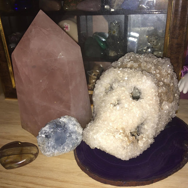
I experimented by using several differently shaped/sized/textured items. I thought that using semi-transparent crystals would give interesting effects, as the light would penetrate slightly and the paper would react accordingly.
I allowed the papers to sit for 3 or 4 days. To "activate" the cyanotype, they needed to be submerged in water.
The instructions insisted that they needed to become wet to activate the cyanotype effect, but all it did to my pieces of paper was weaken them so that they disintegrated in my hands.


